Wednesday, June 26, 2013

Heimskulegur with Sigur Ros' "Kveikur"


Icelandic natives Sigur Ros –– often confused with being the Icelandic cover band of famed 90's outfit Sugar Ray –– recently released their seventh studio album, Kveikur.  Like all things you read about Iceland on the internet, you're not sure whether you're looking at something written in Icelandic, or if the author had a stroke while typing.  Regardless, listeners looking at Sigur's newest release have no problem asking themselves, "hvað í fjandanum er ég að horfa á."  Despite the undarlegt cover, Sigur Ros's Kveikur is sure to be your favorite Icelandic import of the year (next to pönnukaka of course!).  

Iceland seems to only be in the news when they start to inconvenience the rest of the world: the 2010 volcanic eruptions that left thousands of European travelers stranded at airports; every time Bjork performs at a large-scale music event and wears a swan.  Bottom line: Iceland is one big #FirstWorldProblem.  So it comes at a surprise when the rest of the world begins to react positively to an Icelandic band like Sigur Ros, especially since the band sings most of their songs in Icelandic –– yes, that's Icelandic, not your CD player playing backwards.  Other than being from a place that celebrates New Year's by setting shit on fire – in America, we call that the Los Angeles Lakers winning  – Sigur Ros is known for their outrageous album covers and Kveikur definitely does not fall short.

Perspective matters.  

Before we erupt into Kveikur's explosiveness, let's take a look at Sigur Ros's past albums.  Their debut Von established not only would their songs not contain stereotypical alternative rock lyrics about wearing Hanes white tees, failing to get the number of the girl across the bar, or watching the sunset on a cool summer's night, but you should definitely not buy this album if you're afraid of the Child's Play movies.

Have you ever been looking for something in your attic and accidentally come across your mom's old antique doll collection?  Well imagine that same feeling when looking for Sugar Ray's 1997 classic Floored but come across this terror instead.  Keeping in line with baby-themed album covers, Sigur Ros released their second album, Ágætis byrjun, featuring a praying winged-fetus with either a huge shlong or his small intestine where his umbilical cord should be.  


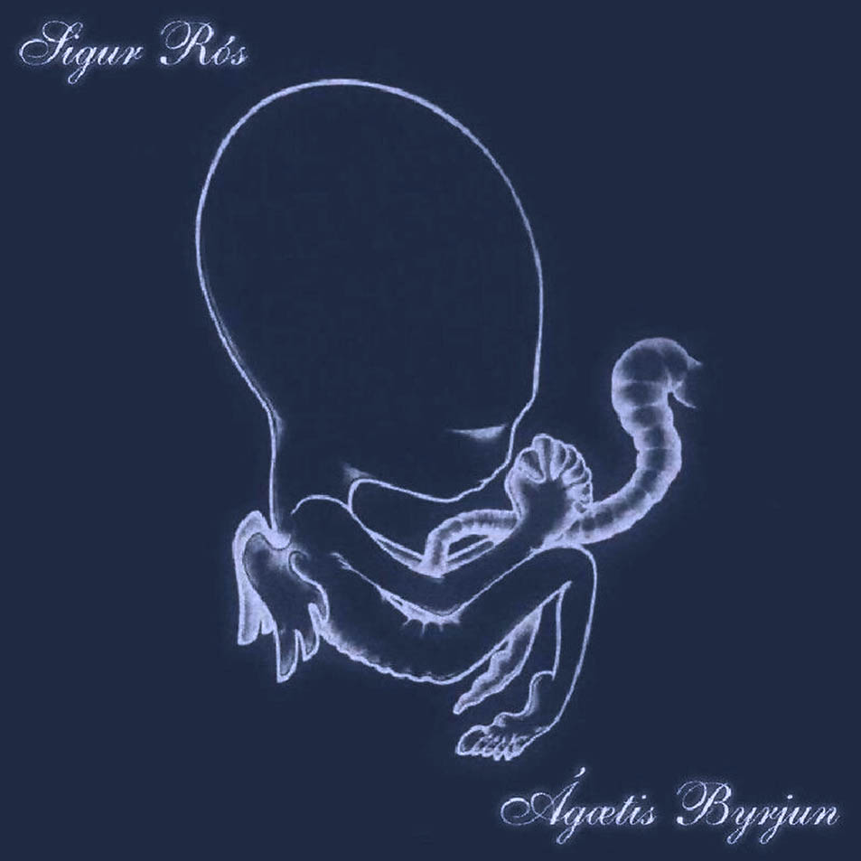
Judging by the shape of its head, the baby either has fetal alcohol syndrome or it's really just a creature from Alien.  A band hadn't shown this much interest in young children and infants since Gary Glitter in the 70's.  After experimenting with babies and fetuses, the band decided to strip down and let their pylsas hang out on 2008's Með suð í eyrum við spilum endalaust.  


First floating fetuses and now flying phallics – this band has established themselves as a force that refuses to chaff.  As long as you apply baby powder and/or lotion, Kveikur is sure to continue this trend.  

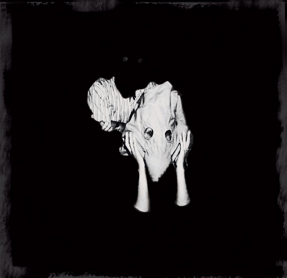
The design element of Kveikur shares a few similarities with Von – heavy black and white tones, unused space, extremely frightening image centered on the cover.  At first glance, it looks as if a white-hooded person is being attacked by a black-hooded person.  Maybe it's some type of social Icelandic commentary on the KKK?  More likely though, it's just another classic scene from MAD Magazine's Spy vs. Spy (the White Spy is always so oblivious to what the Black Spy is up to – but I wouldn't be surprised if he's got a bomb hidden under his skyrta!).  Whatever the case, one thing's for certain: you better hope this isn't hiding behind any copies of Sugar Ray's timeless socio-environmental album about an endangered breed, Music for Cougars, at the music store or you're in for another shock.  

Tuesday, June 18, 2013

Doubting "Hesitation Marks"


Cover art for NIN's new album, Tortured by Tuxedos.
In just three years, Trent Reznor went from being weirder than the emo kid who sat in the back of your high school calculus class to a semi-serious, distinctive, tuxedo-sporting adult.  Known for being the head of the experimental industrial band Nine Inch Nails, the only hardware he's been sampling these days has been his Grammy, Golden Globe, and Oscar awards for his work with The Social Network and The Girl With The Dragon Tattoo.  After nailing the coffin shut on Nine Inch Nails in 2009, Reznor had a small stint forming a less successful band with his wife, How to Destroy Your Marriage – err – How to Destroy Angels, releasing two EP's and an LP.  Though recently, Reznor has announced the reincarnation of Nine Inch Nails with a new tour and album, Hesitation Marks, and judging by its artwork, Reznor hasn't lost his artistic style – nor has David Fincher's influence rubbed off on him too hard.

Nine Inch Nails' albums have always reflected their sound – industrial drums, walloping bass, layers and layers of various noises, the occasional gunshot – so there's no doubt fans don't have to worry about Hesitation Marks sounding like anything they've never heard before.  This kind of consistency traces all the way back to their first album, Pretty Hate Machine.


In 1989, the rock scene was still being dominated by glam bands like Motley Crüe, Posion, and Twisted Sister.  But a new sound was being born on the alternative music scene thanks to bands like Soundgarden, Nirvana, and Alice in Chains who experimented with droned guitars, fast percussion, and numerous layers.  In this mix was Nine Inch Nails' Pretty Hate Machine.  The cover does a great job forcing you to ask yourself, "what is this that I'm looking at?  Is this 'experimental'?  Is that some type of robotic ribcage?" when in reality, people were asking themselves, "why is my sister's hairclip on the front cover of an album for some weird clinically depressed guy's band?"  But the questions didn't stop there.

In 1994, Trent took a jump from heavy synthesizers, or "bee-boop-bo-bee-bee-boops," on Pretty Hate Machine to loud, industrial, hollowed percussions, or "boom-boom-ba-boom-ba-bo's," on The Downward Spiral.


NIN loves "Putin" you in a downward spiral.
Arguably their most well known album featuring that song about fucking like an animal ("Closer") or the one that Johnny Cash covered even though everyone thinks he wrote it and always seems to be played when a famous person with a drug addiction dies ("Hurt"), The Downward Spiral established NIN's everlasting image as a gritty, industrial band.  The album cover epitomize's this with its depiction of what seems to be a close up of a leper's skin with a silhouetted Russia on it.  The biggest message The Downward Spiral displays is that if 1994 had a yearbook, Trent Reznor would have been voted "Least Likely Musician to Win a Golden Globe AND an Oscar."


After returning to his former electronic-influenced artwork on 2005's With Teeth, featuring a pixel-bleeding NIN logo into a pile of...bloody pixels (am I right?) and 2008's The Slip showing some guy's head with pixels cratering into it, Trent has yet again ventured to the land of obscure, rusty, leper-skin-like album covers.  Tired of destroying angels and his reputation, Trent revealed the cover for NIN's upcoming Hesitation Marks.  Initial reactions to the artwork have fans reminiscing about The Downward Spiral.  Yet after a second look, many are wondering if his newfound relationship with David Fincher is starting to take a toll on his artistic output.  Here, we see a rusted, highly saturated blue and orange wall with cracks of red coursing through the bottom.  So far, vintage NIN.  Then we make our way to the top of the cover.  When observing any Nine Inch Nails album, Trent wants to preemptively plant the question in our minds, "what do you think of when you think of highly-layered, industrial rock music?"  Answer: FISHING.  Nothing says Nine Inch Nails like fishing lines so why not put them at the most focally-important part of the album cover: at the top.  Has Trent's hiatus from NIN been so long that he's lost any and all ability to make sense, or did he just spend too much time watching Deadliest Catch?  Either way, NIN is back and this is one angel he won't ever destroy.


Thursday, June 6, 2013

Getting Prehistoric with "The Devil Put Dinosaurs Here"


Alice in Chains (not to be confused with the adult moviestar and scene girl, Allison Chainzzz) has returned with their second AL (Anno Layno/After Layne) album, The Devil Put Dinosaurs Here.  Longtime fans of the band have always been very outspoken against replacement singer William Duvall after singer Layne Staley's untimely death in 2002.  They asked questions like, "will he try to sound like Layne?" and statements like, "it's not Alice without Layne."  Sure, I agree it's not truly AIC without Staley, but you can't restrict Jerry Cantrell and co. from continuing to make music under the original name they made for themselves.  Would Layne want the show to go on?  Most likely.  Would he want them to make an album about dinosaurs?  Debatable.  Maybe not.  Actually definitely not.  Actually why the fuck is a band who has an album cover with a girl lying in dirty, dried mud now coming out with an album cover with a triceratops skull on it?  


Mr. Maxell, 4th cousin to Mr. Facelift
Before we get all prehistoric, let's take a look at AIC's past releases.  Their debut, Facelift, depicts a highly saturated dude in primary colors with his face getting...uh...lifted.  I like to imagine him being distantly related to Maxell's "Blown Away" guy, aside from the fact that Mr. Facelift can't take a pounding of music to the face like he can.

1992 saw the aforementioned Dirt, Alice's most prominent album to date.  Within their first two years, Alice in Chains had released two albums that were not only musically advanced, but showed some pretty disturbing images sure to disrupt your perusing the cassette aisle at The Wiz (Nobody Beats the Wiz).  


Bands from the 90's are notorious for adding shock-value to their album art (i.e. Black Crowes' pubey Amorica, Tool's contortionist-blowing-himself Ænema) and fans were typically pretty receptive to them.  

Then AIC came out with their self-titled Alice in Chains depicting a sad three-legged dog, and rather than making you go, "Alice in Chains is so freakin' badass with these dark album covers!" you say, "awww why'd they have to do that?"  And thus dawns the age of ambiguous Alice in Chains album covers.


Alice in Chains roared back into mainstream rock with 2009's Black Gives Way to Blue showing a depleted heart from what looks to be your high school anatomy textbook on a chalky black background.  At the time of its release, Jerry spoke about the meaning behind the album cover and name and how it represented their reincarnation from despair, sort of like a reversed "Hey Hey, My My" ('Out of the blue and into the black').  Cool, Jerry, totally get that.  But then what the hell are you doing talking about dinosaurs now?  Supposedly, it has to do with some type of super religious blah blah blah bullshit.  Since Jurassic Park 2 [BEGIN DINOSAUR RANT], it hasn't been cool to be down with dinosaurs if you're over the age of eight.  Dinosaurs are supposed to be badass, now they're just popular kids cartoons (see Dinosaur Train).


Cartoon dinosaurs weren't always lovingly cute and stuffed-animalized –– they used to have serious concerns like, "shit, my mom is battling a dinosaur named 'Sharptooth' right now and is going to die, this sucks," (RIP Littlefoot's Mother).  Now their biggest concern is, "what tropical location should I ride the Dino Train to today?"  And Jerry, picking a triceratops for your band's album cover called The Devil Put Dinosaurs Here?  Do you really think the devil was the one who put herbivores here?  If he was, then he must be a vegetarian because no meat-lovin' devil is going to put a herbivore here.  And if that's the case, the last thing I want is a vegetarian Satan telling me how he's a vegetarian.  That's a hell not even hateful AIC fans would wish upon William Duvall.

Wednesday, June 5, 2013

Burning the Torch on "13"


The fathers of metal...the procreators of hard rock...the daddy's of doom...maybe not that last one, but Black Sabbath, the founders of rock's loudest and heaviest sect, is back with their newest release, 13.  Ozzy Osbourne, Tony Iommi, and Geezer Butler show no age reuniting while leaving Bill Ward, their longtime drummer, as well as their health restrictions and Black Sabbath catalogue circa 1983-1995 in the dust.  With their return also comes the revival of arbitrary album covers, proving that Sabbath really is back.

Being arbitrary makes up a big part of "being metal."  The metal community feeds itself on "being metal."  But what does it mean to be "metal"?  Wearing black and studs?  Being down with the devil?  Combining words like "goat" and "whore" to name your band?  Asking John Wayne Gacy to design your album's cover art?
John Wayne Gacy's design for Acid Bath's  debut album
Screaming "SLAAAAYEEEEER" at the most opportune times?  These many facets of "being metal" has become a sort of joke in the community itself.  However, everyone outside the circle takes the metal community way too seriously.  There's a reason why the masses blame Marilyn Manson, Rammstein, Pantera and other metal bands for acts of violence instead of Justin Bieber, Rihanna, or Beyonce.

GWAR disemboweling Snooki 
Though, these attempts at "being metal" show that metal bands don't even take themselves seriously (with some restrictions, like the As I Lay Dying singer who hired a bounty hunter to whack his wife).  So why try so hard to be so "metal"?  Is it metal to name your band "Pissing Razorblades?"  No, but it's hilarious.  Is it metal to disembowel a lifesize plastic Snooki doll on stage?  No, it's actually disgusting, but also hilarious.  And what does this tangent about metal have to do with the album art for 13?  Because burning a giant "13" on the Buckingham countryside outside London for the flames to be seen from miles is actually pretty fuckin' metal.


Before we light the torch on 13, let's take a look at some Ozzy-era Sabbath album covers.  First, we have the classic self-titled Black Sabbath.  No other band at the time had ever released anything like this before.  With its sludgy riffs, loud bass, grizzly drums, and bellowing vocals, listening to this album for the first time is like your dad slapping you in the face after you just got a splinter pulled from your foot and yelling, "SHUT UP, YOU'RE A MAN NOW."  And the cover perfectly reflects its musical style showing some creepy pale lady standing in a field behind some medieval houses, just like that one time when you and your friends decided to go camping in the Pocono's and you wandered across some territory you probably shouldn't have.


In 1973, the band came out with Sabbath Bloody Sabbath, their fifth album in just three years.  The cover features a demon-possessed bed attempting to consume its subject like a Satanist version of the Ecstasy of Saint Teresa.  The guy on the bed looks shocked, like, "why is my bed trying to possess me?"  But let's be honest, that's what you get when you have a bed with "666" molded in at the top.

Now, over 30 years later, Ozzy has stopped hanging out with the wrong crowd (Justin Bieber in Best Buy commercials –– it's okay Ozzy, we've all had Bieber Fever before) to record a new Sabbath album.  And what better way to reestablish yourself as the archetypal metal band than burn an eight-foot-tall number "13"?  It may seem arbitrary, but the beauty of it comes from its simplicity –– no complex design, no agonizing graphics, just a blazing-orange "13" in a dusked blue field.  Now that's metal.


Monday, June 3, 2013

Checking the Time on "...Like Clockwork"


Queens of the Stone Age returns after a six-year hiatus with their newest, weirdest, reddest release, ...Like Clockwork (typing out those "..." is going to get old really fast) showing a modern day spin on the Phantom of the Opera with some chick crying blue.  Ya know, like we all do when we're held tight by a man wearing a skull mask.  Lead singer Josh Homme employed his BFF Dave Grohl along with other contributors Trent Reznor, Mark Lanegan, and Queen of the Modern Age, Elton John, leaving fans to hope that they threw the most glitterly, twisted, dark get-togethers to watch the new Liberace biopic Behind the Candelabra while reading 1984.  With a pretty extensive and cryptic publicity push through its release, the album leaves fans wondering, "what does it all mean??"  But like wondering how to pronounce Josh Homme's last name (hom-mee?  ho-mee?  Gr-ohl?), sometimes it's better not to ask questions...or really wonder at all.

Queens of the Stone Age (or "Queens" or "QOTSA" or "Eagles of Death Metal" or "Them Crooked Vultures" or "anything else Josh Homme has ever done") is known for being a band that not only makes you take the time to think about their music, but also question the legitimate meaning behind their album covers.  Let's take a look at their most well known release, 2002's Songs for the Deaf (what?  WHAT?), a concept album about taking you on a road trip from Los Angeles to the Joshua Tree through the Bible Belt of California.


Combine that with its album cover depicting a devil wand and you get this uber-religious meaning and you're all like, "wow Josh Homme is a genius!"  But let's be honest.  This is not a statement on Christianity sharing similarities with Satanism ––– Josh Homme ain't down with the devil.  Some guy who was hired to design the cover had two requirements: make it red (achem, Blues for the Red Sun, anyone?) and put a trident missing one of its -dents (a dident?).  But he couldn't come up with any idea other than to just warp a devil staff on Photoshop (Edit -> Transform -> Warp).


After their try at being anti-religious and conceptual, they came out with 2005's Lullabies to Paralyze, or as I like to call it, Pagan Girl Offering Radioactive Jam.  'Nuff said.


That then brings us to 2007's Era Vulgaris featuring two lovable lightbulbs, Bulby and his pal Stumpy the Pirate (how many Josh Homme's does it take to name a lightbulb?).  This fluorescent duo shines brighter than any cartoon pairing I knew of growing up.  Brighter than Batman and Robin, flashier than Tommy and Chuckie, shinier than Barnacle Boy and Mermaid Man – their action figures could have been luminously lovely: "Bash out some tunes with Bulby!  Complete with working cigarette and razor-sharp edged head!  Don't forget about his washed up pal Stumpy the Pirate, complete with hat, eyepatch, peg-leg, and refund for purchasing this album for thinking it would be good after playing '3's & 7's' in Guitar Hero!" In a perfect world, I like to think these two are best buds with the phallic-like Mandy and Brandy from Tool's Vicarious video and have crazy playdates and play "Trip Acid Like We're In A 90's German Domination Club" instead of "House" or "Doctor."


And now ...Like Clockwork has arrived.  The band gained notoriety earlier in the year when they released cryptic hand-written letters to various music magazines talking about how they've been dealing with dark times, emotions, having no control, something about codeine cabarets, etc.


This lead to the release of a handful of music videos which turned out to be cartoons of mostly human beings wearing what looks to be BDSM clothing set in a Quentin Tarantino fantasy-blood-world.  Combine that with a creative execution that allows fans to enter in their phone numbers and receive a weird voice message from Josh Homme and you've got a pretty cool tactic to make some buzz.  But what do these themes of time, and cryptic messages, and darkness have to do with the album's cover?  Nothing.  Could the skeleton-mask man represent dark emotions and the woman (supposedly Homme's wife) represent how the band had no control over their direction and they let their emotions take over?  Just like what we saw with Songs for the Deaf's "religious tones," this isn't a commentary on anything.  It's just some guy on Photoshop who had a cool idea.